
For a full guide to using the Commonwealth brand, download our brand guidelines and logo kit.
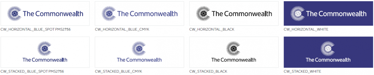
Master logo
The Commonwealth Secretariat is a vibrant and relevant organisation. The logomark retains the history and value of the Commonwealth brand. It provides a cleaner and more versatile mark that reflects the dynamism of the Commonwealth.

Logo versions
The Secretariat's master logo is available in a limited number of colours and formats. The blue horizontal version of the logo is our primary logo. Please be careful to select the correct logo based on your usage, whether that’s on screen or in print or using a special finish.
The EPS version of the logo is best for materials that will be professionally printed or reproduced at a large size.
The JPEG version has a white background and is suitable for most word processing applications.
The PNG version has a transparent background and is suitable for most web applications.
Print logos
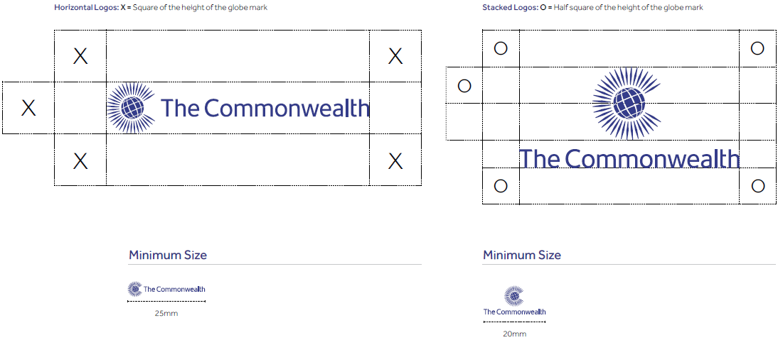
Clear zones and minimum sizes
The logo should be allowed space in order to maximise its visual presence. Clear zones have been defined and these areas should be kept clear of any other graphic elements. Clear zones are proportional to the size of the logo and therefore must be calculated accordingly.
Similarly, in order to maintain clarity, the logo should not be reproduced any smaller than the minimum sizes outlined here.
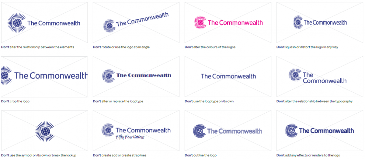
Things to avoid
To ensure the Commonwealth communicates consistently, it is important that logos are used exactly as supplied and not reproduced or altered in any way.
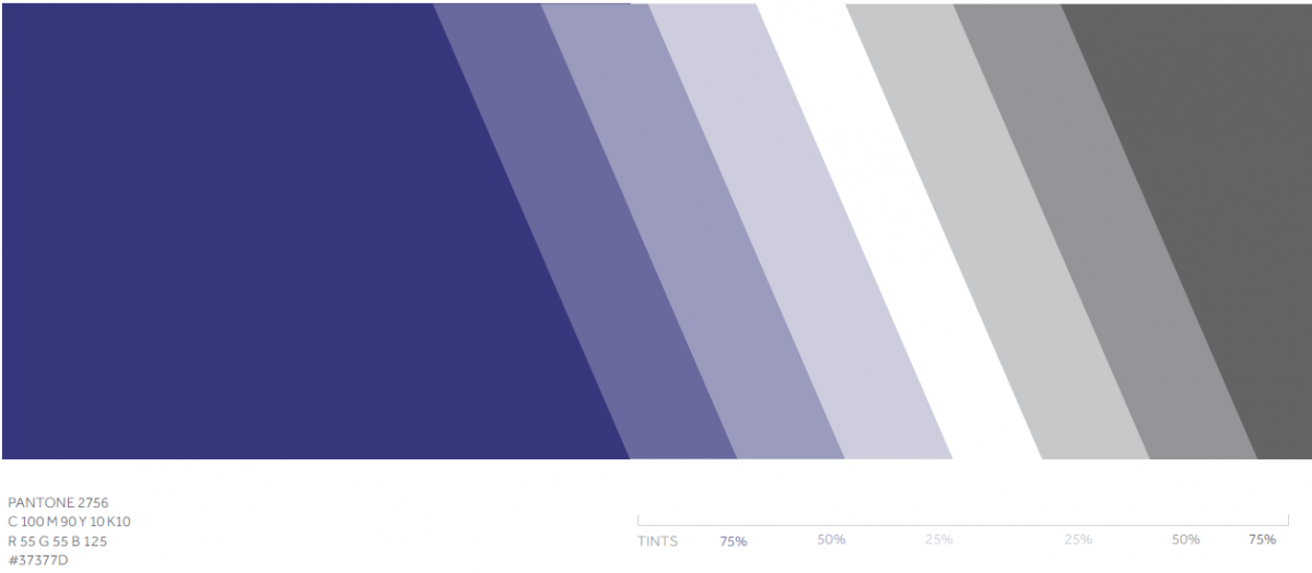
Primary colour palette
Our primary palette is Commonwealth Blue accompanied with white and black. This limited palette should be used in most situations when communicating the core Commonwealth brand. Ensure the correct colour tint is selected based on usage, whether that is on screen or in print.
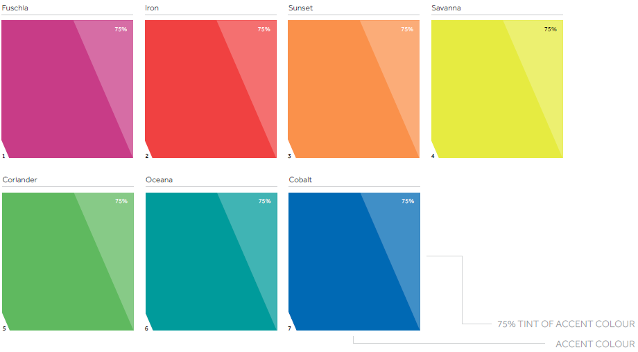
Secondary colour palette
When creating material on specific subject matter, a relevant accent colour can used in conjunction with the primary palette. In general, only one accent colour should be used at a time. The 75% tint of the accent colour can be used with the accent colour.

If you need any help or advice in implementing these guidelines, don’t hesitate to get in touch.